Unlocking Actionable Insights: The Power of IoT Data Visualization Tools for IoT Analytics Dashboards
In the rapidly expanding landscape of connected devices, the sheer volume of information generated by the Internet of Things (IoT) can be overwhelming. To transform this deluge of raw sensor data into meaningful, actionable intelligence, organizations critically rely on sophisticated IoT data visualization tools for IoT analytics dashboards. These powerful solutions are the bedrock for understanding complex patterns, identifying anomalies, and making data-driven decisions that drive operational efficiency, enhance customer experiences, and unlock new revenue streams. This comprehensive guide will delve into the essential components, best practices, and advanced considerations for leveraging these tools to their fullest potential, ensuring your IoT initiatives yield tangible business value.
The Critical Role of IoT Data Visualization in Modern Analytics
The promise of IoT lies in its ability to provide real-time visibility into operations, assets, and environments. However, raw data from thousands or millions of sensors – temperature readings, pressure levels, GPS coordinates, machine states – is inherently complex and difficult for humans to interpret directly. This is where IoT data visualization becomes indispensable. It serves as the bridge between raw telemetry and human understanding, converting intricate datasets into intuitive, easy-to-digest visual formats.
Without effective visualization, even the most advanced IoT analytics platforms would struggle to deliver their full impact. Visual dashboards allow stakeholders, from engineers to executives, to quickly grasp the current state of affairs, track key performance indicators (KPIs), detect trends, and spot anomalies that might indicate equipment failure, security breaches, or inefficiencies. This immediate insight is crucial for proactive decision-making, enabling businesses to move from reactive problem-solving to predictive maintenance and optimized resource allocation.
Challenges of Raw IoT Data and the Visualization Solution
- Volume and Velocity: IoT devices generate data continuously and at high speeds. Visual tools aggregate and summarize this data, making it manageable.
- Variety: Data comes in diverse formats from various sensors and devices. Visualization normalizes and presents this disparate information cohesively.
- Complexity: Interdependencies between different data points are often hidden. Visual representations, such as correlation matrices or network graphs, can reveal these relationships.
- Time-Series Nature: Most IoT data is time-stamped. Specialized time-series charts allow for tracking changes over time, identifying patterns, and forecasting.
Key Features of Effective IoT Data Visualization Tools
Choosing the right IoT data visualization tools is paramount for building effective IoT analytics dashboards. These tools are not one-size-fits-all; their efficacy depends on their ability to handle the unique demands of IoT data. Here are the essential features to look for:
1. Real-Time Data Processing and Display
For many IoT use cases, such as industrial process monitoring or smart city traffic management, real-time insights are non-negotiable. The chosen tool must support low-latency data ingestion and display, ensuring that dashboards reflect the current state of devices and operations with minimal delay. This often involves integration with streaming data platforms and efficient rendering engines.
2. Customizable and Interactive Dashboards
Users need the flexibility to tailor dashboards to their specific needs and roles. This includes:
- Drag-and-Drop Interface: Simplifies the creation and modification of dashboards.
- Widget Library: A rich selection of pre-built visualization widgets (charts, gauges, maps, tables).
- Filtering and Drill-Down Capabilities: Allows users to explore specific data subsets or delve deeper into anomalies.
- Role-Based Access: Ensures that users only see the data relevant and permissible to them.
3. Support for Diverse IoT Data Types
IoT data is incredibly varied. An effective visualization tool must proficiently handle:
- Time-Series Data: For tracking trends over time (e.g., sensor readings, device status).
- Geospatial Data: For location-based insights (e.g., asset tracking, fleet management, smart cities).
- Categorical Data: For grouping and comparing different device types or states.
- Event Data: For logging specific occurrences or alarms.
4. Robust Integration Capabilities
No IoT solution exists in isolation. Visualization tools must seamlessly integrate with:
- IoT Platforms: AWS IoT, Azure IoT Hub, Google Cloud IoT Core, etc.
- Data Sources: Databases (SQL, NoSQL), data lakes, message brokers (Kafka, MQTT).
- Business Intelligence (BI) Tools: For unified enterprise reporting.
- APIs: For custom data ingestion and external system connectivity.
5. Scalability and Performance
As the number of connected devices and the volume of data grow, the visualization solution must scale effortlessly without compromising performance. This requires efficient backend architectures, optimized query processing, and potentially distributed computing capabilities.
6. Security and Data Governance
Protecting sensitive IoT data is paramount. The tools must offer robust security features, including:
- Authentication and Authorization: Secure access controls.
- Data Encryption: In transit and at rest.
- Audit Trails: To track data access and modifications.
- Compliance: Adherence to industry-specific regulations (e.g., GDPR, HIPAA).
Types of Visualizations Essential for IoT Analytics Dashboards
The choice of visualization type significantly impacts how effectively insights are communicated. Here are some fundamental visualizations crucial for IoT analytics dashboards:
- Line Charts: Ideal for displaying time-series data, showing trends, seasonality, and anomalies over time (e.g., temperature fluctuations, power consumption).
- Gauge Charts: Perfect for showing real-time status of a single metric against a predefined threshold (e.g., tank levels, machine utilization rates, battery status).
- Heat Maps: Excellent for visualizing density, concentration, or magnitude across a geographical area or a specific grid (e.g., sensor network coverage, temperature distribution in a building).
- Geospatial Maps: Indispensable for tracking mobile assets, visualizing smart city infrastructure, or monitoring environmental conditions across locations. Points on the map can represent devices, with color coding for status.
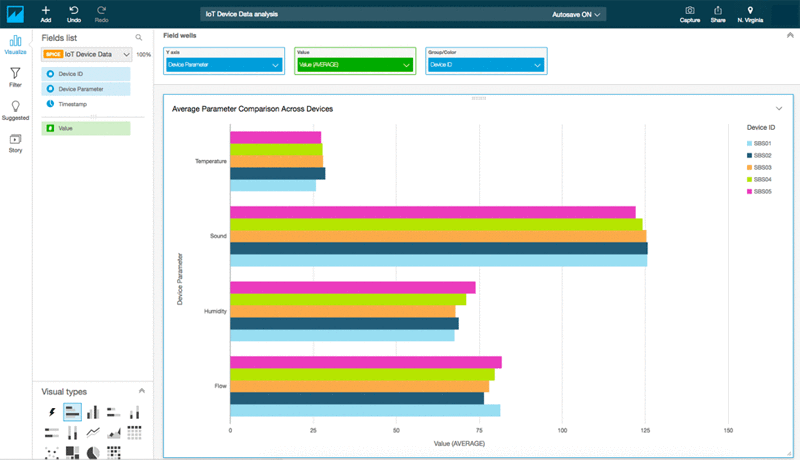
- Bar Charts and Pie Charts: Useful for comparing discrete categories or showing proportional distribution (e.g., number of devices by type, distribution of alarm types).
- Scatter Plots: Helps identify relationships or correlations between two different variables (e.g., temperature vs. humidity, machine speed vs. vibration).
- Table Displays: While not a "visualization" in the traditional sense, well-formatted tables are crucial for displaying precise raw data, detailed events, or aggregated summaries.
- Custom Widgets: Many platforms allow for the creation of custom widgets to display unique IoT metrics or integrate specialized data feeds.
Building Actionable IoT Analytics Dashboards: A Practical Guide
Creating an effective IoT analytics dashboard goes beyond simply dragging and dropping charts. It requires a strategic approach focused on user needs and actionable insights. Here's a practical guide:
1. Define Clear Objectives and KPIs
Before designing anything, answer: What problem are you trying to solve? Who is the audience? What key metrics will indicate success or failure? For example, a dashboard for predictive maintenance might focus on machine health scores, vibration levels, and anomaly alerts, while a smart building dashboard might emphasize energy consumption and occupancy rates.
2. Understand Your Audience's Needs
Different users require different views of the data. Operators need real-time, actionable alerts. Managers need aggregated summaries and trends. Executives need high-level KPIs and business impact. Design separate dashboards or provide customization options for each persona.
3. Choose the Right Visualizations for Each Metric
As discussed, select chart types that best convey the information for each specific KPI. Avoid clutter; less is often more. Focus on clarity and immediate comprehension.
4. Implement Intuitive Layout and Navigation
Organize information logically. Group related metrics together. Use clear labels and consistent color schemes. Ensure easy navigation between different dashboards or drill-down views. Consider a "summary to detail" approach.
5. Prioritize Actionable Insights
A dashboard isn't just about showing data; it's about enabling action. Highlight anomalies, provide context, and suggest next steps. Integrate features like threshold-based alerts and notifications that can trigger automated responses or human intervention.
6. Iterate and Refine
Dashboard design is an iterative process. Gather feedback from users, monitor their usage patterns, and continually refine the dashboards to improve their utility and user experience. What works today might need adjustments as business needs evolve or new data sources become available.
Advanced Considerations for IoT Data Visualization
As IoT deployments mature, so too do the demands on visualization. Here are some advanced aspects to consider:
A. Integrating Predictive Analytics and Machine Learning Insights
The true power of IoT data is unleashed when combined with advanced analytics. Visualization tools should be able to display the outputs of machine learning models – for instance, a probability of equipment failure, forecasted energy consumption, or classification of an anomaly. This moves dashboards from merely descriptive to truly predictive and prescriptive.
B. Edge Computing and Data Locality
With the rise of edge computing, some data processing and even visualization might occur closer to the data source to reduce latency and bandwidth. Visualization tools should support hybrid architectures, allowing for seamless data flow and visualization whether processing happens at the edge or in the cloud.
C. Data Storytelling and Contextualization
Beyond presenting numbers, effective visualization tells a story. This involves adding context, annotations, and narrative elements to dashboards. For example, explaining why a particular anomaly occurred, or detailing the business impact of a trend. Tools that allow for rich text, image embedding, or even video integration can enhance this storytelling aspect.
D. Interoperability and Open Standards
To avoid vendor lock-in and ensure flexibility, consider tools that support open standards and offer robust APIs for data exchange. This allows for easier integration with existing enterprise systems and future technologies.
E. Ensuring Data Quality and Governance for Visualization
The principle of "garbage in, garbage out" applies strongly to visualization. Ensure that the data feeding your dashboards is clean, accurate, and consistent. Implement robust data governance policies, including data validation, cleansing, and lineage tracking, to maintain the integrity of your visual insights.
By focusing on these advanced considerations, organizations can elevate their IoT analytics dashboards from simple data displays to strategic assets that drive profound operational and business transformations.
Frequently Asked Questions
What is the primary purpose of IoT data visualization tools?
The primary purpose of IoT data visualization tools is to transform vast, complex, and often real-time data generated by Internet of Things devices into understandable, actionable visual formats. They help users quickly identify trends, detect anomalies, monitor performance, and gain insights that are critical for decision-making, operational efficiency, and problem-solving within IoT ecosystems. Essentially, they make sense of the noise, turning raw data into meaningful intelligence for IoT data analytics.
How do IoT analytics dashboards improve operational efficiency?
IoT analytics dashboards significantly improve operational efficiency by providing real-time visibility into key performance indicators (KPIs) and operational states. By visualizing data from sensors and devices, businesses can:
- Monitor Asset Health: Detect early signs of equipment malfunction, enabling predictive maintenance and reducing downtime.
- Optimize Resource Allocation: Track energy consumption, usage patterns, and inventory levels to optimize resource use.
- Enhance Process Monitoring: Gain immediate insights into production lines, supply chains, or environmental conditions, allowing for rapid adjustments.
- Identify Bottlenecks: Pinpoint inefficiencies or choke points in processes through visual data analysis, leading to process improvements.
Can IoT data visualization tools integrate with existing business intelligence (BI) systems?
Yes, most modern IoT data visualization tools are designed with robust integration capabilities, allowing them to connect seamlessly with existing business intelligence (BI) systems. This is often achieved through APIs, direct database connectors, or by pushing processed IoT data into a data warehouse or data lake that your BI tools can access. This integration ensures that IoT insights are not siloed but become part of a holistic enterprise data strategy, enabling a unified view of operational and business performance. It allows for advanced cross-domain analysis, combining IoT data with CRM, ERP, or financial data for deeper insights.
0 Komentar